Let me explain...
Everything a Postcard Shouldn't be...
The blog theme I have achieved thus far revolves around the idea that postcards glamorize destinations and always portray their subject matter through technically 'perfect' pictures. The pictures on this post are in accordance with my idea of what a postcard should entail: true to the energy of the city, portraying it's unique characteristic (ugly or not), and focusing on the simple qualities that set the destination apart from others (and not just landmarks or famous sites).
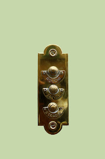
These photographs go further than that though. I attempted to de-glamorize them, as well as Florence. The objects that I chose are unusual or ugly, but continue to be very Florentine. The objects are also set against solid colors (which are reminiscent of Florence's color palate) and at times are awkwardly off center.
These are some of the objects which I will remember Florence by. Yes, the Duomo and the Arno will forever come to mind when I reflect on this study abroad experience, but so will the strange coffee makers and the heinous toilets. So, here is my Florence... Wish You Were Here
'Hanging out' in Italy
This theme is more literal in the sense that I found many of my pictures shared this theme of 'hanging'. You will find many pictures of laundry hanging from windows, leather boots hanging for sale, and so on. Having Italy as the background to these pictures makes these simple objects so aesthetically stunning. I hope this provides a little glimpse of what it has been like to hang out here on a day to day basis.
Subscribe to:
Comments (Atom)


